Wednesday, June 1, 2011

Evaluating unit 19

My first impression of the unit was a negative. The main reason was the fact it was all about design (something I'm really not good at unless some great idea comes to mind) and nearly nothing about the media. The idea to have a blog individually I think is great, and this is where the unit started to add up to the rest of the course. The only thing I can complain about is the obligation of post AT LEAST two times per week. Unless I feel like or find anything worth posting about, it's not healthy to force a post or two just to fill the blog and shut the lecturer's mouth. It's not right for both myself as the student nor the lecturer. This case reminds a lot of the oh so great Reflective Journal along with the new comer Technical Journal (why not just add a spiritual journal as well). But now I'm getting out of point.

About learning basic Photoshop and Illustrator I can say I'm happy with what I learned. If I ever come up with an idea for picture manipulation or photo-montage, or even a quick cover for some work I've done and want to present, I can just do it. It will not be to professional standard, that's why I stick with the idea of leaving these things in the hands of those who know better, but at least now whenever I can, I just do it myself.

The infographic task gave me a hard time, until I came with a clear idea of what to do, how and why. Once I had the idea clear it was a matter of using what I know to get close as possible to what I imagined and I guess the result is nearly better to what I had in mind. In the end it was fun, especially once I saw the funny infographic which still gave the information clearly.

Then came the mediacast blog! Like everyone first thing that came to me was, not another blog!  The funny part was that it wasn't just another blog. I may have learned a thing or three during the making of this blog but I have to confess (like there was any need) that I hated the thing. The team work thing didn't work out well with this one, even though we were with whom we work best. The only simple reason for this was that no one really knew what to do, what was happening, what's the next step etc. Well in the end we managed to do what we were asked, even though I'm not sure if I fulfilled my role of Developer right.

Overall there were things I most definitely hated and others that I enjoyed, well mostly the knowledge of using Photoshop and Illustrator. 

Giovan out!

The Mediacast Blog


This is a screen shot of the Mediacast blog main page (not that other pages look much different). This is the link for the blog http://mediacastblog.blogspot.com/  

Not sure what else I can say...so,

Giovan Out!

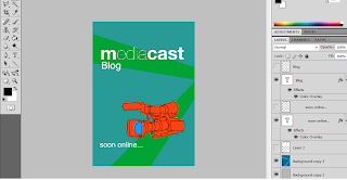
Mediacast blog Posters

Same as the banners I was new to Photoshop but most importantly I had no inspiration, no idea to what can I do to promote our Mediacast blog. So I went with trial and error and achieved some good yet strange designs. I first came out with this;


which was then turned into this;


both have the same concept just a slightly different approach. Even though I like them they lacked the spark for a promotional poster. Remaining nearly on the same formula I made these;


They're actually the same with different colours and some position changes in text etc. They maybe eye catching but they also lacked the spark and they look funnily retro as well. After these I made two more posters with the pictures I took.


These lacked originality but achieved some spark. In the end the second one was chosen (after some touches) to promote the blog accompanying two other posters from other members of the team.

Giovan Out!

Final Banners

Realizing how much the previous banners sucked I tried  to experiment with other ideas. The first one I did wasn't much of an improvement.


The main problem was the border. To make it short this one was also scrapped. So then I tried to stick with black/grey/white colouring and went more experimental (with an uninspired mind). This was the result:


To be fair I actually liked this one. The only problem is the burn surrounding both the logo and the cartoon camera is cut out of the picture, and I imagined how strange it would look as a banner. I didn't scrap this one, I left it for discussion with the team. Next I went more colourful  and wanted to make it resemble one rendition of the posters. 


It's not half bad but I guess the colours aren't much applicable for a serious scheme. It reminds me of a retro disco flyer or something. I may have tried different colours but this one worked most in my eyes. Next is the most simple in terms of Photoshop stuff, and the most applicable for the blog banner.


It's just a black and white photo of a desk full of media related things, with a block white title on top. By the end this was voted as second preference for the Mediacast blog.

Giovan out!

Wednesday, April 27, 2011

Media Cast Blog banners

For Task 3 of unit 19 we had to individually present at least three banner designs to the rest of the blog team to decide and choose one. These here are the ones I made. I was out of fresh ideas and inspiration is out of the question, I'm not that excited about this blog. What I mean here is that, Media Cast having a blog/site is a great idea and is actually needed, but I'm not interested to take responsibility for such a thing. Whatever the case these are the banners:


All I did in this one is took a picture of my camera, put it on a black background and added the title for the blog.


For these two I just kept the black, white and green theme and put the title in a sort of style but keeping it serious.

Origami Project Update

The pictures on the right are showing the first finished stage that I'll be using to present the animation on.  The first finished stage because this one was brutally attacked by one of my cats. Ok he only slept in the stage three times and broke down the green screen in the process. The second version is just the same thing with a darker green screen and stronger support.


Also the storyboard is ready with detailed instructions on what to do on stage whilst giving light to the story. Oh yes the title is the one written above the stage. I went with a free hand calligraphy just to make it more raw and simple. I know it's a long title but it's understandable.


On the 26th of April I began my first shooting day. Not everything went as smoothly as planned but it was fun. One of the draw backs would be the crappy and cheep tripod I used. You would do a smoother tilt hand held while tap dancing. The second draw back is more of a disappointing problem. The green screen didn't work out as panned. Due to lighting, shades and other small defects on the cardboard, the keying process couldn't work out well. On the bright side the animation is awesome and it's not half bad with just the green cardboard for background. I'll just think of something to make it more interesting for the rest of the scenes.

Giovan Out!

Sunday, April 10, 2011

Introducing the Origami Project

The origami project consists of a short stop motion animation using origami characters to narrate the story. The story is planned to be not much longer than 3 minutes and will be presented on a small cardboard stage. It is about the tale of an origami duck's life adventures, and will be told by animated captions, the way characters interact with the environment and with a musical track. The track is a simple composition I made mostly on piano and was recorded on 8th April 2011.

The concept for this project has been running around in my ming for quite a while now. What made finally start working on it was the AEGEE-Valletta and CommA Short Film Festival. The funny part is when I was told about it, it was three weeks from the deadline (24th April 2011) and it's possible that I don't finish the job on time. This id due the fact that it my first time doing stop motion and because I have other stuff to do, like school assignments, which are a higher priority at this stage. Right now I only finished the track, a rough storyboard and the stage (which still needs some finishing touches).

Reaching the stated deadline or not I'm now all fired up to finish this project and will update more as I progress.

Giovan Out!

Monday, April 4, 2011

Promo Ideas

Being about Jazz, a musical genre not known by many today, and is also consider as something classic or old, my first idea for the promo was to deliver a sort of nostalgia of the said "old". To make this happen I was planning a sort of time changing sequence to show the days when Jazz was mainstream up to today when it is more classical, alternative and a good memory passed on by generations on vinyl. I imagined the commercial to start in the 1940s' with a band playing Jazz in a bar, then moves forward in time to the 60's-70's with a scene of a man listening to Jazz on vinyl with his son. Further in time comes a scene of another man (the grown up child of the last scene) finding his fathers' collection of records and plays them and reminisce about his childhood, looks at his old piano wanting to play Jazz. He is then presented with the product and that's that. all of this story would have been narrated by an accompanying voice over. Being complicated and quite expansive I scraped the idea especially after conducting research on the target audience.

The second concept was to make a story about a common person in search of an alternate music and finally finding Jazz and learning hot to play it on piano with the product. To tackle this concept I opted for a surrealistic approach. So I changed a little the final message and came with the concept of using a metaphorical corridor of musical genres and a person walking trough. Eventually he/she finds a door marked as Jazz and with the help of the product he/she menages to open it and play Jazz on a piano. The message behind this story is to not worry about following the alternative, specifically jazz, there's a solution to easily play it on piano with the book Jazz Piano from Scratch. The only problem is that because the message is presented metaphorically it can be easily not understood or worst; misleading.  If tackled delicately and with thought the idea can be enhanced for better understanding. This process will take place during the composition of the storyboard. 

Jazz, Piano from Scratch

Meeting Date: 04/Apr/2011
Locations:

  • Corridor
  • Room with piano

Talent:

  • Actor / Actress

Props:

  • Piano
  • Book
  • Small table
  • Key
  • Lables

Equipment:

  • Tripod
  • Camera
  • Light for room
  • Microphone

Mind map:

  • Corridor
    • School Corridor (after school hours)
    • Hotel corridor

Storyboard to be provided
Script provided by Giovan
Shoot number 2 to be discussed (Green Screen)
Audio: Background effects / classic background Jazz music
Filming to be spilt with the group
Ideal shooting day: Wednesdays
Actor:
First Scenes:

  • Relaxed, common person

End Scenes:

  • Formal (suit)

Friday, April 1, 2011

Target Audience

After receiving enough feedback from a questionnaire I passed out on Facebook I could start to define a target audience for the book I chose (Jazz Piano from Scratch). Being an alternative genre the first audience to come in mind is small and most these are veterans in music playing, so the Jazz Piano from Scratch doesn’t appeal that much for them, except maybe for teaching. With this analysis the conclusion is to find a wider and more appropriate audience.

I passed the mentioned questionnaire to a wide variety of people with different life styles. Less than half of the people answered but I’ve got enough material to construct an audience profile. The questionnaire is on a separate page along with the results.

It is clear from the results that most people are not familiar with Jazz which is the main subject of the selected book. With that confirmed, it is also given that most of them show interest in the subject, some even said that they’re going to search about it (when asked what they’ll be doing after conducting the questionnaire). There were some others that although in the first question they chose that they prefer to stick to some genres, they still show interest in the alternative or at least became curious into what is Jazz in the first place. The questions regarding playing a musical instrument resulted in a 50/50 with a little advantage towards those that would like or already play an instrument. Most of the people that conducted the questionnaire confirmed they are open to music genre. This is an advantage when it comes to actually convincing that the product is something they should consider. For the second question I wanted to know the most popular medium people use to listen and/or discover there music. I asked this question to see how open the audience’s source when searching for music is, the most open currently being the internet (and the one mostly chosen). So it is safe to say that even though Jazz is not your everyday kind of music it’s still one step away of the audience reach.

In conclusion the target audience for this advert is especially those open to musical genres, use the internet as their source for music and ideally does not play any musical instrument but desire to do so. This combination is the most logically possible audience that would consider or even be convinced to buy the Jazz Piano from Scratch. Reason being, if someone already knows how to play an instrument - say the guitar, the odds of trying to learn Jazz on piano are near to none. Also those open to music genres have a more solid ear to appreciate the alternative, and with an open source like the internet it’s easy to say that a quick search on the subject would bring them more into the Jazz culture. A second kind of audience to target is those professional piano teachers that should find the book useful for their students when teaching Jazz and improvisations.


Questionnaire + results:


·        (1)Are you open to music genre or (2) do you stick to some specific genres?
Results: (1) = 12, (2) = 5

·        You find/search your music on (1) radio (2) TV (3) Internet (4) Other?
Results: (1) = 2, (2) = 0, (3) = 15, (4) = 6

·        Do you play or aspire to play a musical instrument?
Results: Y = 9, N = 8

·        Are you familiar with Jazz and its Culture?
Results: Y = 7, N = 10

·        Would you consider an interest in Jazz?
Results: Y = 11, N = 6

·         If you play or want to play a musical instrument would you try something different like Jazz?
Results: Y = 9, N = 8

·        After conducting this short questionnaire you'll;
(1) continue whatever you were doing and forget about this
(2) search something about Jazz
(3) contemplate on the time you wasted with this questionnaire
Results: (1) = 9, (2) = 7, (3) = 2

More Background Research

Technical Resources

For the camera and tripod  we'll be using the ones provided by the school (MCAST Institute of Art and Design). For the tracking shots, a steady-cam along with a small HD camera is required. These I'll provide them myself since I'm in possession of a steady-cam Merlin and a Sony HVR-A1E (HDV cam). Being HDV I tried compatability with the JVC HD cam from school during editing and it works fine. For a shot in the advert there's a possible need of a green/blue screen. This could also be provided by the school but we still have to discuss the scene/shot carfully before we book the green/blue screen.

Budget


Apart from buying the actual product and transport, there isn't much expense to budget for. The equipment to be used during production is provided by the school (Camera and tripod) and other equipment that I already have in my possession.

Regulation


The promo is to be suitable for every age, sex and race. Hence it follows an Everyone regulation.

Deadline


Hand in date of the final promotional video is on the 23rd of May 2011.

Thursday, March 17, 2011

"What Dreams May Come" Playstation 2 advert


This advert is part of a series of adverts directed by David Lynch and was code named "what dreams may come". The ad consists of one shot of a dog in his sleep in what appears to be a wash-room. The picture and colouring used is pretty simple and realistic, uses what look like natural lighting. The dog twitching is a sign that he's dreaming. The advert ends with the caption stating to the audience to "Visit Your Third Place". The black background and the white particular font is a typography indicating the brands identity. The font is the same font used for the Playstation 2 logo. The caption gives the audience the understanding the concept behind the advert, that is implying that the product (the PS2) is your place of dreams, the Third Place.

Tuesday, March 15, 2011

The "Client" ABRSM


The ABRSM (Associated Board of the Royal Schools of Music) is an international educational organisation that provide examinations in music. Exams vary for every grade, syllabus and instrument. This examination board is accredited by the Ofqual (Office of Qualifications and Examinations Regulation) to award graded and diploma qualifications in music on the UK National Qualifications Framework. Exams are divided into five sections; Practical exams, Theory exams, Practical musicianship, Jazz exams.

ABRSM is also a production house that specifies in printing music related books. Most of these books consist of syllabus, sheet music and exam papers for interested students and teachers. The organisation also runs profesionally courses and seminars for teachers for the royal schools which are :
  • Royal Northern College of Music
  • Royal Academy of Music
  • Royal College of Music
  • Royal Scothish Academy of Music and Drama
____________________________________________________________

All information is credited to the Wikipedia page and the Official Site

Fictional Client Brief

The Associated Board of the Royal Schools of Music (ABRSM) is starting to promote their books via broadcasted adverts on diverse television stations. It's not their aim to promote the actual publishing house but rather their music books. This is so potential clients would be open to choose from where to buy the books.

To do this the ABRSM are organising a world-wide competition for media related students to make a creative and technical promofor any book published by the mention publishing house.

Competitors should follow this criteria:
  • Must be 60-seconds in length
  • Must be a book from ABRSM
  • Must fall under the 'G' rating criteria as regards to regulation
  • Make it short, fun and entertaining

Thursday, March 10, 2011

An Infographic on graphic design


This is my result of the Infographic we had to make for Unit 19s assignment first Task. The aim of the Infographic was to depict some keywords used in graphic design. At first I had no idea what to do, how to picture the given keywords. I came up with some ideas like the balance for Optimizing and the hand for the Image Capture, but had no complete concept. A plain chart with the randomly placed pictures was the only idea coming to mind when brain storming.

It came to me while I was studying for the driving theory test. Seeing all those road signs (which are also good examples of infographics) I thought of using the concept of a road with signs, billboards etc. The picture above is the result. The idea is that "The Guy" is posing in front of a camera, that has the RGB symbol on its screen. The RGB colour space is used for screens, monitors and TVs thats why I did that. A hand coming out of a computer monitor is taking the picture taken from the camera into the pc, symbolizing Image Capture. The PC is connected to a balance which has "size and "quality" written on the left and right plates respectively. A good way (at least in my head) to represent Optimizing. The warning sign on the left shows a single pixel accompanied by a stick figure made out of pixels. Right behind it there a billboard with the CMYK symbol. CMYK colour space is mostly used for printing (billboards, posters, flyers etc). Also a magnifying circle shows how even though its magnified it has the same quality, meaning it's vector; as it is pointed out by 'The Guy". "The Guy" also point out that the image poster on the right is raster. This poster also show the difference in bit depth.

Everything in the picture was drawn by myself using the pen tool on Illustrator, except for the raster picture. Everything was then individually coloured and placed on Photoshop. For "The Guy"s shirt I found a flower pattern which I then cut to fit the shirt to get the a Hawaiian Shirt effect.

And I guess that's enough on the infographic I'll be back when I come up something else to fill up this blog.

Giovan Out.

Friday, February 25, 2011

A Jazzy thing


For the 1 minute advert assignment I chose this (picture above) non-fiction book. Well I firstly was searching for an average but fun cook book, but being bad in research I found none and so I opted for a musical book. Being a novice piano player and jazz lover I tried searching for a book that fits both and I found this one to be an interesting product for an advert.

The benefits it offers as suggested by vast reviewers is that it's designed for beginners to teach in simple and fun steps to understand and play jazz on piano. It inspires music students into the world of jazz with activities and exercises, which eventually lead to solos, rhythm and improvisations.  This without doubt is this products USP for it opens a new and vast musical opportunity with an easy to follow guide.

The book also comes with a full-length CD  which apart from having audio representations of what the student is supposed to do, it provides interesting exercises and some accompanying trio tracks for the student to experiment and jam. Not many books about jazz for piano provide anything like this. Actually I have found none, but I guess my research doesn't count since I'm not good at it.

For does who seek a more advanced approach in playing jazz on piano, this is not their book. It is strictly for beginners and teachers (to use in their lessons), though the same author (Charles Beale) has his own franchise of jazz books in teaching piano, most of which target a more advanced audience.

I already got some ideas on how to tackle an advertisement for this but I won't work on them until further research on a target audience and such, is conducted.

Giovan out!

Tuesday, February 22, 2011

Film Appreciation...NOT

Every Friday at 10:00 am we (media students Ext Dip) gather unsupervised in the media auditorium to watch a selected film, which we have to finally analyse, discuss and report in our reflective journal. I personally found the idea quite interesting and helpful. At last I watched a De Sica film (which I never had the chance to search for and actually watch), Ladri Di Biciclette and the Godfather trilogy (still ongoing). It is a smooth experience to look forward to every week since everybody is so interested, quiet and mature during these hours... Yeah right! Here's an example of what truly happens during these film appreciation hours:


I blurred the video on purpose, I didn't want anyone to take this personally. But you can still see/hear people gathered round, talking about whatever. Another playing randomly the piano, two reenacting a fight from Fight Club  and others just walking dementedly around the class. All of this and more happened during part 2 of The Godfather...
"What!? How can anyone not care about The Godfather!?"
Strange but true, and the worse part is I couldn't understand shit what the characters were saying and what was actually happening. Some even packed everything up in a rush, as if Vito Corleon himself came out of the screen with an F'ing Uzi to turn us all into pulp, when at 2/3s of the film it faded to black into a brief pause, and were like "oh come on will this movie ever end!?" when it started out again. Some may say that they already saw the film or that they're not interested in that type of film, even brought up the excuse it had no subs which is fair enough because the films sound isn't that much clear.  Still I think it no excuse to interrupt people like myself from trying to watch it, right?

I feel disgusted by this behavior and am thinking of not coming to this class anymore and watch the chosen films comfortably at home were there's no one jumping around, randomly playing the piano and the rest, not even from my 3 year old niece. I guess the only solution for this chaos would be the company of a lecturer during these films. At least some control could be obtained... or not. Whatever the case I felt that this had to come out of my living skeleton chest, and before I hear that anything HAS changed for the better I won't be attending the class, I don't have the problem of loosing stipend because the "whoever takes care of it" decided I was not "eligible". So, that's it I guess. If anyone finds this post offensive, unethical or inappropriate for the blog just comment, leave your feedback and if said to delete it I will do so.

Giovan out!

Monday, February 21, 2011

Something about Infographics


Infographics- short for information graphics- is basically when a set of information and/or data is given in a graphical/pictorial presentation. The picture above is a simple but good example of how things we see everyday are presented in picture instead of text. The pictures are generally simple for the eye to recognize what they present without reading .

Text can be quite an issue when for example a business man is presenting the marketing success of a company. That's where infographs come in, to simplify the said presentation for the audience attention and understandability. Also it makes life a lot easier for the presenter to explain whatever he/she is try to.

I could go into more detail but it's as simple as that basically .
Giovan out!